Textiles (MA)

LINGXI HUA

Lingxi Hua is a talented CMF (Colour, Material, and Finish) designer from China who graduated from the Royal College of Art with an MA in Printed Textiles. Dedicated to inclusive CMF design for disadvantaged communities, she believes in the power of design to positively impact marginalised communities and aims to create solutions that cater to their specific needs. By incorporating inclusive design principles, Lingxi seeks to bridge gaps and promote accessibility in her CMF designs.

Lingxi has volunteered at Stargardt's Connected to support visually impaired children, where she collaborated with CSM students to design a role-playing game for visually impaired children called code breakers to develop their individual personalities. She also worked in a luggage textile studio where she focussed on research and design development for CMF which has been exhibited at several museums in the UK including the V&A and the National Gallery.

Through these experiences, she has developed a unique understanding of innovation in CMF design which she applies to her current work.


Awards: RCA x Logitech Grand Challenge Finalist 2021: New Economic Model for the Ocean.

Degree Details

School of DesignTextiles (MA)PrintRCA2023 at Truman Brewery

Truman Brewery, F Block, First and second floors

The photo of the designer herself.

SimpleTouch - a breakthrough in application design innovation.

Lingxi, an exceptional innovator, maker, and steadfast believer in practice, has built her design practice around the transformative power of tactile experiences. She harnesses design as a medium of communication, shaping our perception of the world.

At the core of Lingxi's design philosophy lies the conviction that the essence of design lies in serving people. She envisions design as a tool for improving the quality of human experiences. She diligently records and reflects on how design can enrich our lives within society. She firmly believes that through continuous introspection and dedicated practice, designers can foster rapid societal development and create living environments that promote well-being.

Driven by a passion for inclusivity, Lingxi embarked on a remarkable journey inspired by her routine grocery shopping experiences. She discovered that the visually impaired face significant challenges due to the inaccessibility of food packaging. Motivated to make a difference, she developed a groundbreaking solution – a set of innovative tactile graphic language labels. This revolutionary system effectively communicates nutritional labelling elements on food packaging, catering specifically to the needs of the visually impaired.

Through this extraordinary project, Lingxi aspires to ignite a broader awareness of inclusive design in society. Her aim is to cultivate a warm and welcoming shopping and dietary environment, ensuring the visually impaired can navigate their health with ease. By shedding light on this issue, Lingxi seeks to champion the cause of inclusivity, promoting the well-being of all individuals in our shared community.

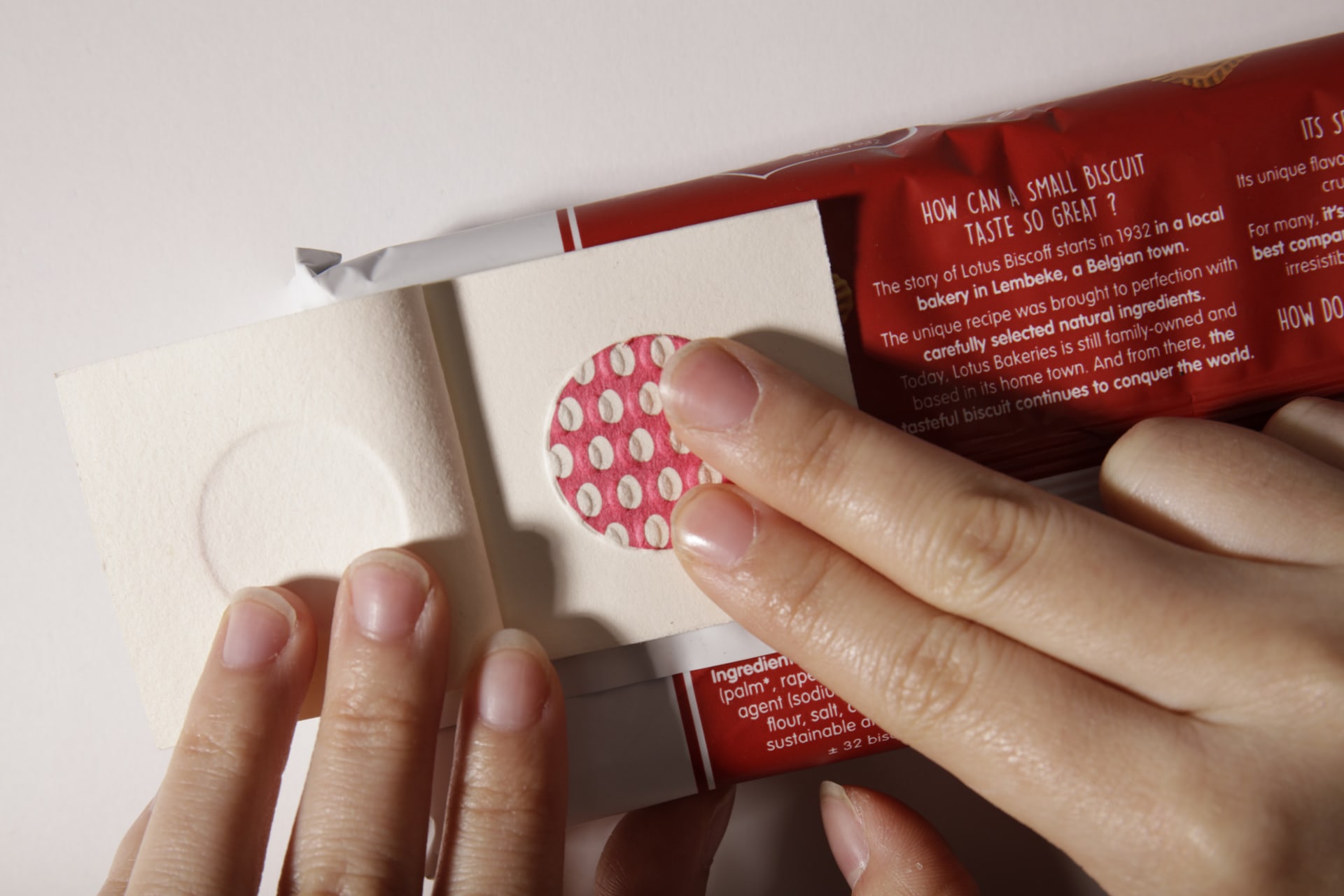
Touchable nutrition booklet label on the food packaging
SimpleTouch is a set of simple pattern design stickers that could become a new language for translating the nutrition labels on food packaging, it also may improve the health of people with visual impairment, starting with little changes.
touchable nutrition label booklet
Details of booklet label

Medium:

Paper

Size:

3.5cm * 5cm
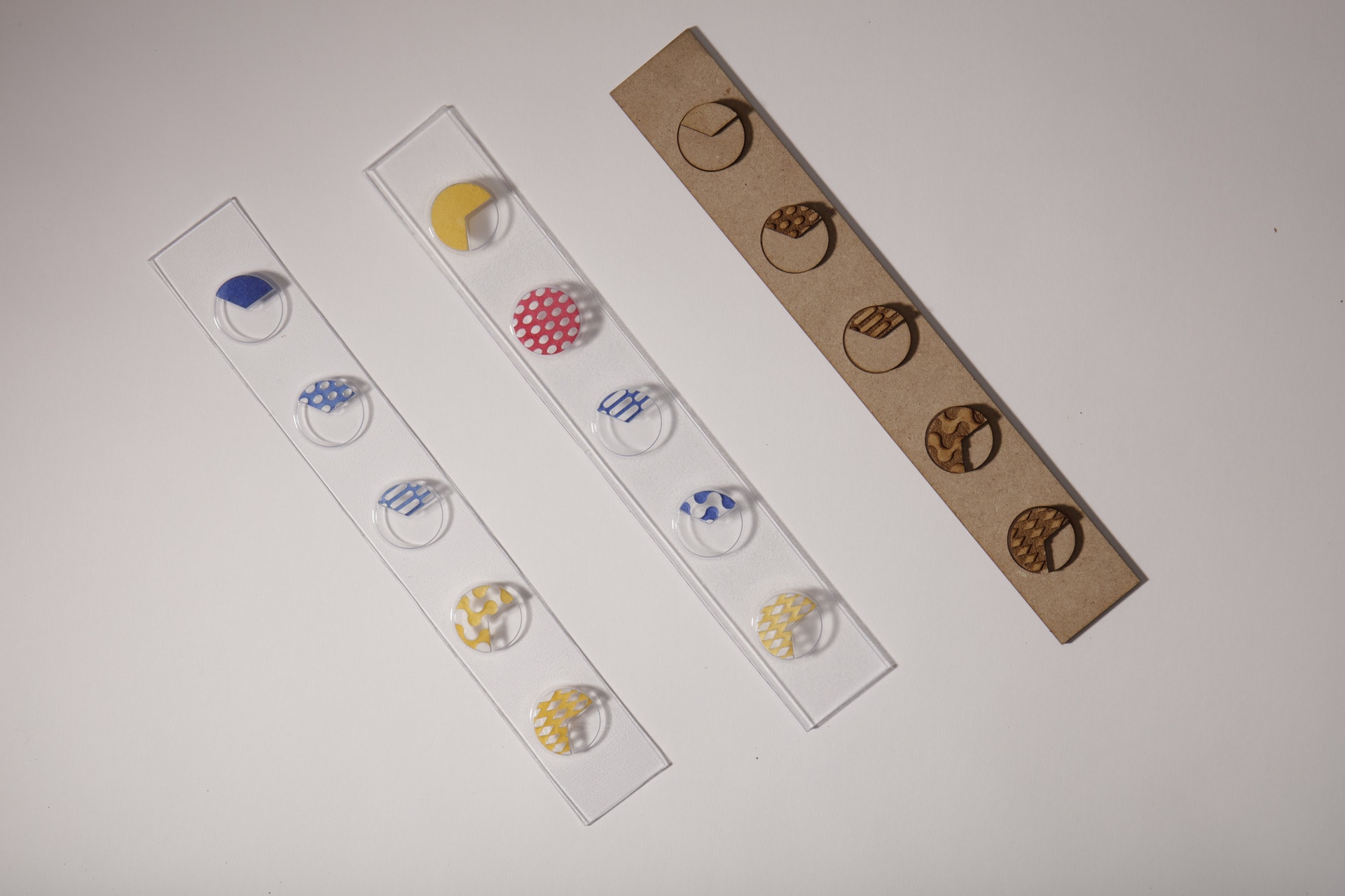
Touchable nutrition label on the food shelf made out of plastics
The innovative label developed is a standardised method of enabling people who are blind or have low vision to access critical information about the nutritional content of food products through the use of tactile symbols. This method has revolutionised the grocery shopping experience for these people.
Details of touchable nutrition label demonstrating interaction
Details of touchable nutrition labels

Medium:

Plastic, paper

Size:

2cm * 30cm
The pie chart has a texture to indicate high, medium or low content
Use shape, texture and colour to indicate high, medium or low content. As shown in the figure, the texture from left to right indicates energy, fat, saturated, sugar and salt respectively. From top to bottom, the content is from low to high.
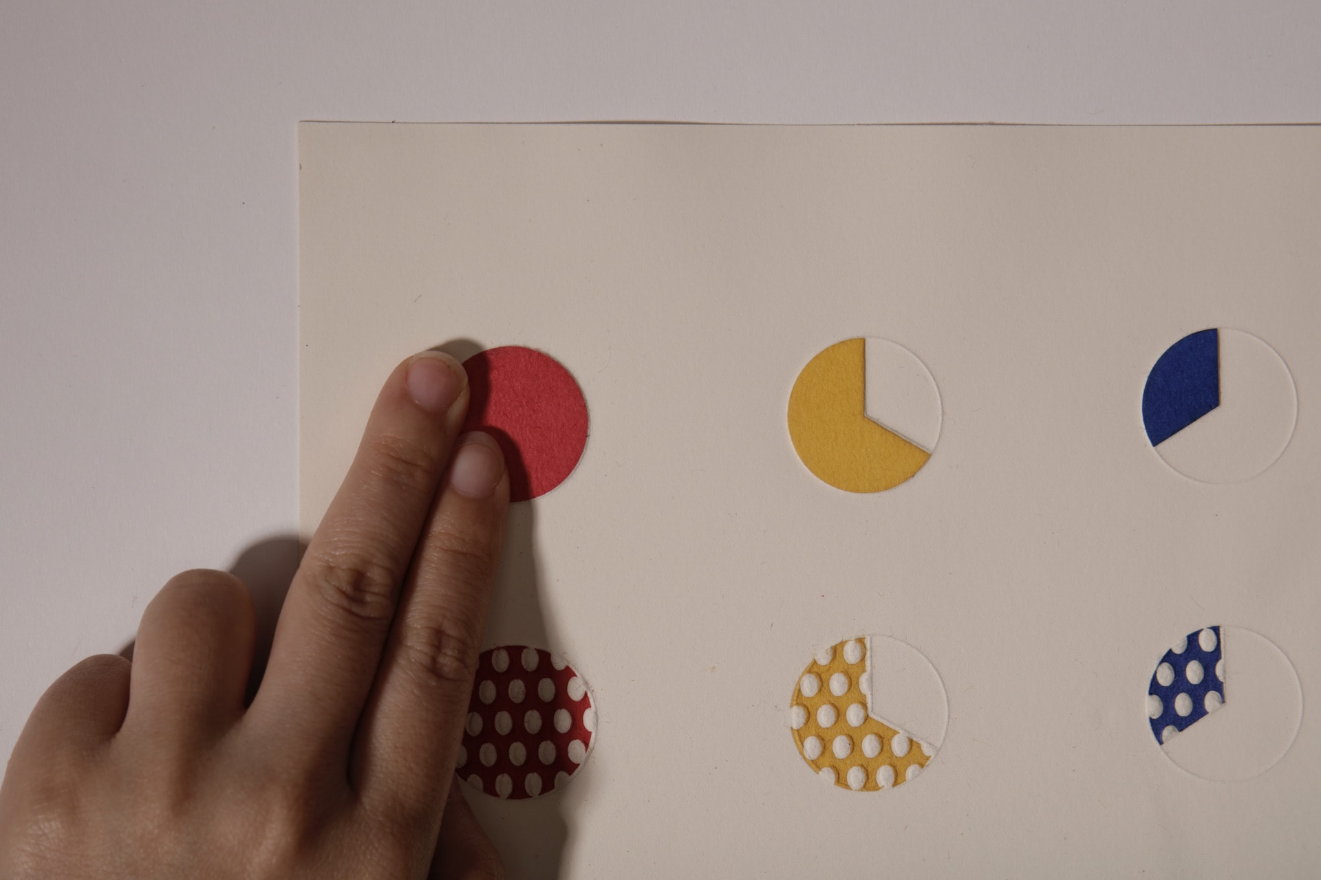
Touch the patterns on the dictionary
Visually impaired people experience label tactile dictionary

Medium:

Paper

Size:

21cm * 29.7cm

The inclusive design of food packaging is urgent

For individuals with visual impairments, the lack of accessible food packaging poses significant challenges and barriers. According to research Nine out of ten blind and partially sighted people said that information on medication or food packaging was quite difficult or impossible to read. Only around seven per cent of people who are registered blind or partially sighted use braille. This not only limits their independence but also puts their health at risk. The studies reported that visually impaired people have an abnormal body mass index (BMI); a higher prevalence of obesity and malnutrition was reported. They want to improve their diet but there is no corresponding food packaging label design for their reference.


Paper dyeing, red, yellow and blue from left to right
ColoringUse a friendly colour scheme for the visually impaired and the colour blind
Creating texture through vacuum forming.
Vacuum forming plastics
Embossing and debossing samples
Testing different paper structures to emboss and deboss
Material testing
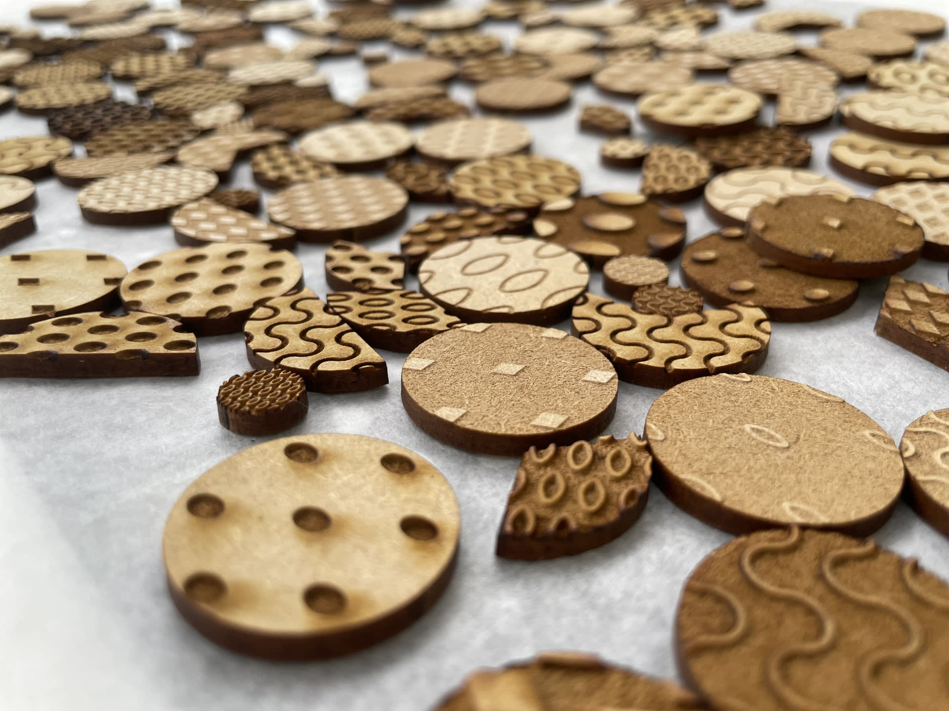
Laser cutting texture to test scales
Scale testing
A visually impaired girl touches the embossed surface.
Invite visually impaired people to test samplesA total of five people participated in the test, including total blindness, partially sighted people and some people with 'normal' vision.
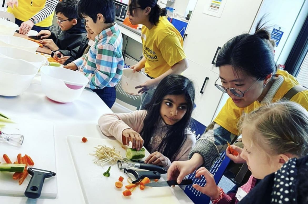
The pictures shows the process of the designer helping visually impaired children cut vegetables
Volunteering to understand the plight of the visually impaired Active involvement with the visually impaired community. Thinking about the design by understanding their daily life to know what is a good design for them and what they really need.